How to Choose the Comparison Page Format AI Will Cite
Choose the comparison structure that makes your facts easy to retrieve, trust, and act on across Google, ChatGPT, Gemini, and Perplexity.
Build your AI-citable content plan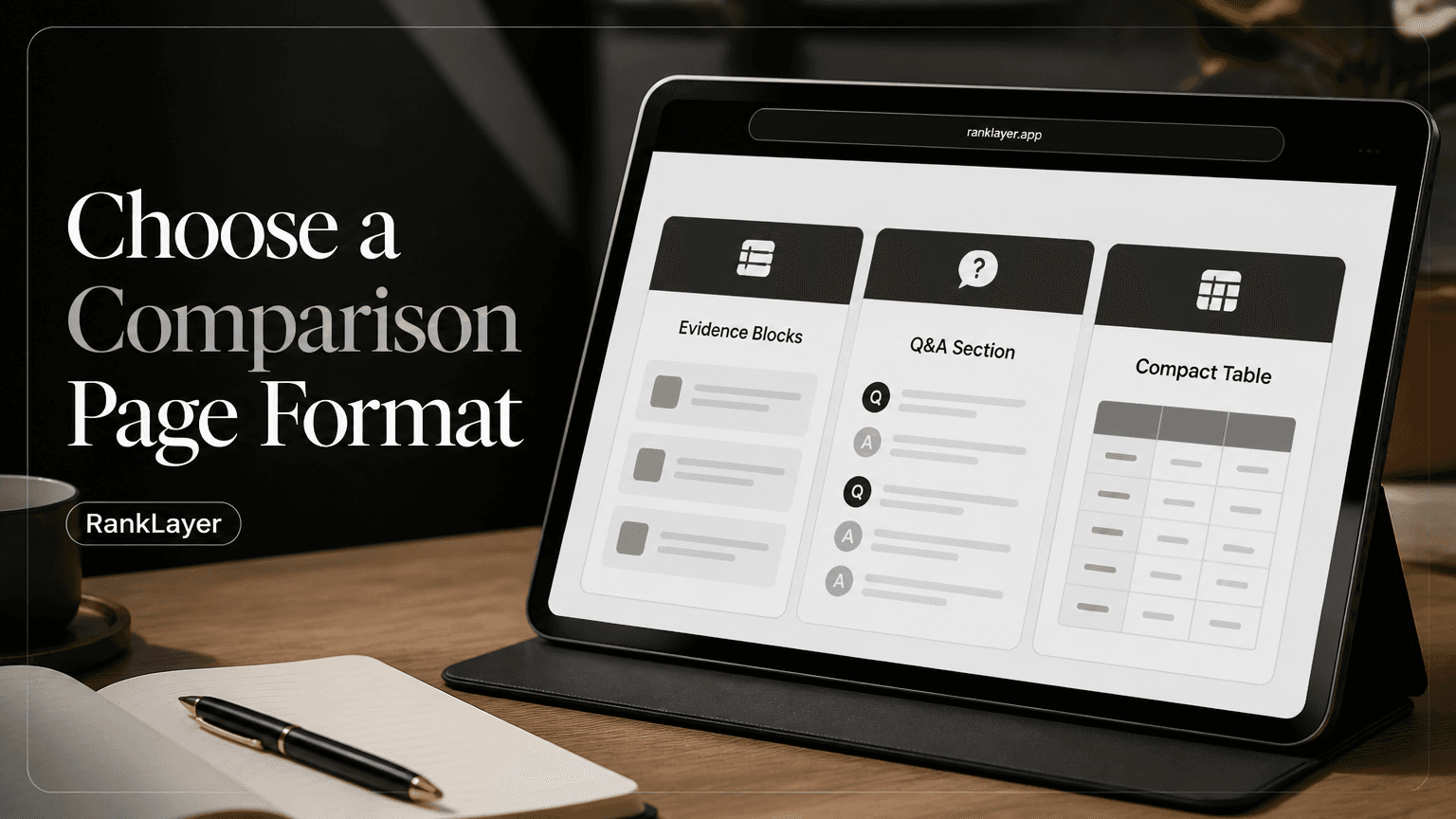
In this article8 sections
- Why comparison page format matters for AI citations
- The three comparison page formats, and what each does best
- When evidence blocks are the best comparison page format for AI citations
- When Q&A comparison pages outperform traditional product comparisons
- When compact comparison tables are the right choice
- How to choose the comparison format with a practical scorecard
- How to test comparison formats over 30, 60, and 90 days
- Common comparison format mistakes that reduce trust and conversions
Why comparison page format matters for AI citations
The best comparison page format for AI citations is not automatically the longest article or the fanciest interactive tool. It is the format that answers a specific buyer question with clear, verifiable information in a section an answer engine can understand and reuse.
For most businesses, the practical choice comes down to three structures: evidence blocks, question-and-answer sections, and compact comparison tables. Each one makes information easy to scan, but they support different search intents and conversion moments.
Imagine a customer asking, “Which automatic blog is easiest for a small business without a website?” A compact table can summarize the answer. A Q&A section can explain the tradeoffs. An evidence block can give an AI a clean, quotable statement such as, “RankLayer includes hosted publishing, so business owners can publish without setting up WordPress.”
No format guarantees a citation. AI systems also consider relevance, source quality, clarity, freshness, and whether a page actually satisfies the query. Google’s guidance on creating helpful, reliable content makes the same broader point: useful content should be written for people, not produced merely to manipulate rankings.
This guide gives you a decision framework, practical templates, and a 30, 60, and 90-day testing model. The goal is not to crown one universal winner. The goal is to match the page format to the question your customer is already asking.
The three comparison page formats, and what each does best
- ✓Evidence blocks are short proof statements, usually one to three sentences, that connect a product attribute to a buyer outcome. They work well when the reader needs a direct fact, such as pricing structure, hosting, integrations, location, delivery time, or a specific limitation. Their biggest strength is quotability because each block can stand on its own without requiring context from five surrounding paragraphs.
- ✓Q&A sections organize the page around natural buyer questions. They are especially useful for conversational searches such as “Which option is better for a dentist with no marketing team?” or “Can I publish comparison pages without a website?” Q&A adds nuance, handles objections, and often produces stronger conversion intent than a bare feature list.
- ✓Compact tables place comparable attributes side by side. They are excellent for fast evaluation when the options share stable, well-defined fields, such as monthly price, setup time, supported integrations, or service area. Tables can reduce cognitive effort, but they become weak when cells contain vague claims, unexplained check marks, or too many columns for a phone screen.
- ✓A hybrid page is usually the strongest commercial format. Use a compact table for orientation, evidence blocks for quotable proof, and Q&A for context and objections. The key is to give each module a distinct job instead of repeating the same claims three times.
- ✓Local businesses and solo founders should favor the format they can keep accurate. A short, current Q&A page is more valuable than a beautiful table with outdated prices. For regulated industries, add careful sourcing, review dates, and appropriate disclaimers before publishing claims about health, legal, or financial outcomes.
When evidence blocks are the best comparison page format for AI citations
Choose evidence blocks when your comparison depends on a handful of decisive facts. This is common for SaaS, local services, online stores, and agencies where buyers want to know what is included, what it costs, and what happens after they sign up.
A strong evidence block follows a simple formula: claim, proof, and implication. For example: “RankLayer is a hosted automatic AI blog, so a small business can publish without installing WordPress or maintaining a separate website.” The first part states the fact, the second clarifies the evidence, and the final phrase explains why the fact matters.
Keep one idea per block. A block that compares price, integrations, publishing frequency, customer support, and editorial review in one paragraph is difficult for people to scan and risky for an answer engine to summarize accurately.
Use precise labels such as “Hosted publishing,” “Google Search Console integration,” or “Daily article generation.” Avoid soft labels such as “Best platform” unless you immediately define the criteria behind that judgment. Specific language gives readers something they can verify and gives AI systems less room to misinterpret.
Evidence blocks are also useful when you do not have a traditional website. A hosted blog can publish clear service, product, and comparison content on a stable URL, while the business owner focuses on customer work. For a practical starting point, review this no-code checklist for connecting Google Search Console, Analytics, and Facebook Pixel without the accidental space before the link syntax.
A useful target is 6 to 12 evidence blocks on a focused comparison page. That is enough to cover the decision without turning the page into a spreadsheet wearing a trench coat. Add a source, date, or qualification whenever a claim can change, especially for pricing, inventory, availability, and software features.
When Q&A comparison pages outperform traditional product comparisons
Use Q&A when the customer’s search is conversational, uncertain, or shaped by objections. Someone comparing two dentists, delivery services, course platforms, or automatic blogging tools rarely wants a feature dump. They want help deciding what fits their situation.
Start with the exact decision question. “Which option is easier for a local business without a website?” is stronger than “Features.” Then answer in two layers: give the direct recommendation or distinction first, followed by the conditions that could change the answer.
For example, a Q&A answer might say, “A hosted automatic blog is usually the simpler option for a business without technical staff because hosting and publishing are handled for you. A self-managed site may offer more control, but it also requires setup, maintenance, and content operations.” This answer is useful even if the reader never reaches the CTA.
Q&A is particularly effective for long-tail queries and voice-style searches. A restaurant owner may ask, “Can I publish menu comparisons without building a website?” A SaaS founder may ask, “Should I compare pricing plans in a table or explain use cases in prose?” Those questions reveal intent that a generic “compare features” heading hides.
Do not turn every sentence into a question. Five to eight high-value questions are usually better than 30 thin variations that repeat the same answer. Group questions by decision stage: fit, cost, setup, performance, trust, and next step.
The conversational keyword patterns for local businesses can help you find realistic phrasing, again without the accidental space before the link syntax. You can also collect questions from sales calls, Google Search Console queries, customer chats, reviews, and support tickets rather than guessing from a keyword tool alone.
When compact comparison tables are the right choice
Choose a compact table when readers need to compare standardized attributes quickly. Tables work best for decisions with a limited number of products and a stable set of fields, such as monthly price, setup time, included hosting, integrations, delivery area, or return policy.
A useful table should normally contain three to seven comparison rows and no more than three or four options on a phone-sized screen. If every cell needs a paragraph of explanation, the table is no longer compact. Move the detail into evidence blocks below it and keep the table as a summary.
Write labels that mean something. “Easy to use” is subjective, while “No WordPress installation required” is testable. Replace unexplained check marks with short descriptions, and use “Not listed” or “Requires confirmation” when you do not have reliable information.
Tables are not automatically more citable than prose. An AI system may understand a clean HTML table, but it still needs context about what the rows mean, when the data was checked, and whether the options are genuinely comparable. Add a short introduction before the table and a plain-language interpretation immediately after it.
Google’s structured data documentation explains that structured data helps search engines understand page content, but it does not replace useful visible information. Treat markup as supporting infrastructure, not a shortcut around clear writing.
For local businesses, a compact table can compare service options without pretending that every customer should choose the same one. Include practical rows such as service area, appointment method, typical response time, and accessibility. Then use a Q&A section to explain exceptions, because local buying decisions are rarely as tidy as a two-column spreadsheet.
How to choose the comparison format with a practical scorecard
- 1
Write the buyer’s exact question
Copy the wording customers use in emails, calls, reviews, and search queries. If the question asks for a quick fact, start with evidence blocks or a table. If it asks for advice or fit, start with Q&A.
- 2
Count the stable attributes
List the facts that can be compared fairly, such as price, setup, hosting, integrations, or service area. Three to seven stable attributes suggest a compact table. Fewer attributes usually favor evidence blocks.
- 3
Identify the main uncertainty
Ask what makes the buyer hesitate. Is it cost, technical effort, trust, migration risk, location, or suitability? Use Q&A to answer uncertainty, and add an evidence block that proves the most important point.
- 4
Score citation readiness
Give each candidate format a score from 1 to 5 for directness, verifiability, standalone meaning, freshness, and ease of extraction. A format that scores 20 or more out of 25 is a strong first test.
- 5
Match the conversion action
Use a table when the next step is selecting an option, evidence blocks when the next step is trusting a claim, and Q&A when the next step is requesting advice or booking a conversation. Keep one primary CTA per page.
- 6
Publish a hybrid only when each module adds value
A common winning sequence is direct answer, compact table, evidence blocks, Q&A, and CTA. Remove any module that merely repeats another section. Shorter pages often convert better when every sentence earns its place.
How to test comparison formats over 30, 60, and 90 days
Do not judge a format after three days. New pages need time to be crawled, indexed, discovered, and included in changing answer results. Use a controlled test with similar topics, comparable publishing dates, and the same primary CTA.
During the first 30 days, measure indexation, impressions, average position, clicks, and engagement. Google Search Console’s Performance report documentation explains how to review queries, pages, clicks, impressions, and average position. These metrics will not show every AI citation, but they reveal whether the page is being discovered and attracting relevant searches.
From day 31 to day 60, compare qualified actions. Track booking clicks, form starts, email clicks, trial starts, add-to-cart events, or calls, depending on your business. A page with fewer visits but twice the lead rate may be the better format for a small company trying to reduce acquisition cost.
From day 61 to day 90, run repeatable prompts in ChatGPT, Gemini, and Perplexity using neutral wording. Record whether your business appears, whether the cited claim is accurate, which URL is referenced, and whether the answer includes a competitor. Treat these observations as directional evidence, not a guaranteed market-wide benchmark.
RankLayer is useful for this workflow because its hosted daily publishing model lets a small team create consistent page variants without building an entire content system first. Connect Search Console and Analytics, tag each template, and compare evidence-led, Q&A-led, and table-led pages using the same measurement window.
A simple forecast can use three variables: indexed pages, citation rate per page, and conversion rate from citation or organic visits. For example, 30 pages at a 10% citation rate produce a very different learning base from 10 pages at a 30% rate. Do not present the result as a promise. Use it to decide which format deserves the next publishing cycle.
Common comparison format mistakes that reduce trust and conversions
The first mistake is choosing a format because it looks impressive. A large table can feel authoritative while hiding weak or outdated data. A long Q&A page can sound helpful while avoiding the one uncomfortable question that actually controls the purchase.
The second mistake is making unsupported superiority claims. “Best,” “fastest,” and “most affordable” need a defined comparison set and a stated method. If you cannot explain how the claim was tested, use narrower language such as “best for businesses that want hosted publishing and minimal setup.”
Another problem is mixing incompatible options. Comparing a local dentist with a national telehealth provider, or a self-hosted content stack with a fully managed blog, can confuse readers unless you explain the decision context. Define who each option is for before comparing features.
Avoid hiding the answer below the fold. Put a two or three sentence verdict near the top, then support it with a table, evidence blocks, or Q&A. Readers should understand the page even if they only scan the headline, opening answer, and first module.
Finally, do not publish once and forget the page. Prices change, integrations move, locations expand, and product capabilities evolve. Set a review date, record the source for each changing claim, and refresh the page when Search Console queries or customer objections show a new decision pattern.
A strong template looks like this: direct verdict, compact table with five rows, six evidence blocks, four buyer questions, one qualification note, and one CTA. For examples of concise opening copy, see these headline and lead-sentence formulas for AI answer engines, removing the accidental space before the link syntax when publishing.
Frequently Asked Questions
Which comparison page format is most likely to be cited by ChatGPT, Gemini, or Perplexity?▼
No single format is guaranteed to earn citations. Evidence blocks often make individual facts easy to quote, while Q&A sections match conversational questions and compact tables summarize standardized attributes. The strongest page usually combines these formats with clear sourcing, current information, and a direct answer near the top.
Are short comparison tables better than long-form pros and cons?▼
It depends on the decision. A short table is better when buyers need to scan stable facts such as price, setup, hosting, or integrations. Long-form pros and cons are better when the options involve tradeoffs, exceptions, or different user types. Use the table for orientation and the prose for judgment.
When should I use Q&A instead of a traditional product comparison?▼
Use Q&A when customers ask conversational, situation-specific questions or have objections that a feature list cannot answer. It works well for queries involving budget, technical ability, location, timing, compliance, and suitability. If the buyer mainly needs side-by-side specifications, start with a compact table and add Q&A below it.
How do evidence blocks improve comparison page conversions?▼
Evidence blocks reduce the effort required to verify an important claim. A concise statement that connects a feature to a buyer outcome can build confidence before the reader reaches the CTA. They work best when claims are specific, qualified, and supported by a source or a clear explanation of how the information was checked.
What should a comparison page include if my business does not have a website?▼
Start with a stable hosted page that clearly identifies your business, offer, service area, contact method, and comparison criteria. Add evidence blocks for important facts and Q&A sections for common objections. A hosted automatic blog can provide the publishing foundation, but accurate information, useful content, and consistent updates still matter.
How many comparison pages should a small business test first?▼
Start with 10 to 30 pages organized around closely related buyer questions rather than publishing hundreds of near-duplicates. Divide them between two or three templates, such as evidence-led and Q&A-led pages, while keeping the audience and CTA consistent. Review performance after 30, 60, and 90 days before scaling the winning pattern.
Can structured data make an AI answer engine cite my comparison page?▼
Structured data can help search systems interpret page elements, but it cannot force a citation. The visible content still needs to be accurate, relevant, accessible, and useful to readers. Use structured data as a technical support layer alongside clear headings, concise answers, descriptive tables, and trustworthy evidence.
Ready to test a comparison format without building everything from scratch?
Explore RankLayerAbout the Author
Vitor Darela de Oliveira is a software engineer and entrepreneur from Brazil with a strong background in system integration, middleware, and API management. With experience at companies like Farfetch, Xpand IT, WSO2, and Doctoralia (DocPlanner Group), he has worked across the full stack of enterprise software - from identity management and SOA architecture to engineering leadership. Vitor is the creator of RankLayer, a programmatic SEO platform that helps SaaS companies and micro-SaaS founders get discovered on Google and AI search engines